

Georgia State University | BFA in Graphic Design
Wednesday, December 3, 2014
Friday, October 17, 2014
Wine Bottle exploration...
All of these bottle names have interesting titles, I purposefully sought out ones that have a lot of potential with their names, in my opinion, but also had branding design that could be improved upon...


…except for this one, 'Manikay,' I love this transfer technique! Each of those dots are transfer pieces, and the aboriginal art seems appropriate. 'Manikay' has a Pinot Noir, a Chardonnay, and a Merlot that I saw. All handling the design in the same way, but with different colored dots.


Taking note of the Rorschach inkblot approach...


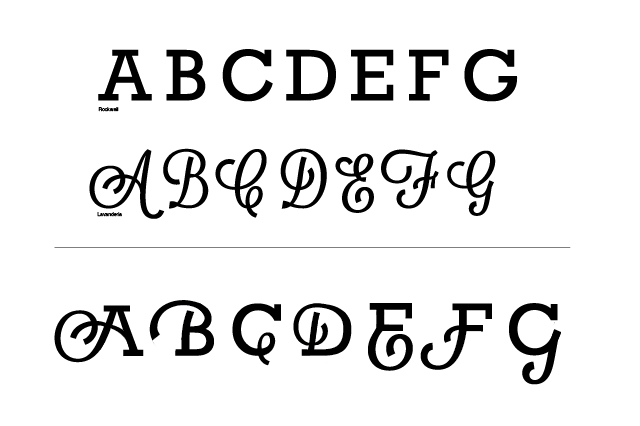
I am leaning towards using hand lettering/script in a transfer. These label boundaries need to be broken!
Sunday, October 5, 2014


Block Type

____________________________________________________
Type is in every nook and cranny!
These examples are hidden beneath benches, on the back of doors, inside of flower pots, and up above eye level. This creates a sentimental effect of endurance (or maybe it just becomes visually interesting) after wear gives it imperfections and texture. Either way, these examples come from parking lots and public places within Atlanta, and they're the kind of things that the longer you look at them the more interesting they are.
Monday, September 29, 2014
It's Common Cents

Typeface creation made of the most Common Cents around...
The penny is the most common cent tossed into a tip jar, a street-musician's instrument case, and your local restaurant's fountain. Despite having monetary value, this typeface is made up of the underdog of cents, the most left-behind and forgotten-of-all cents, but nonetheless a piece to all of our bus-stop remains and couch-cushion leftovers.
I liked the idea of creating a new value for my -- mostly -- disregarded pennies which, consequently, I had no guilt cutting up. But once I did, I found myself coveting them during the process and referring to them as 'trinkets,' which I would never have done prior to cutting them up and changing their purpose.
You can tell how much a coin has been handled through their polish and their age, and many of the pennies that I spend have outlived me. This makes them interesting pieces of our system even though they are nearly disregarded as valuable outside of piggy-banks. But now these 29 cents can have a more exciting purpose than the other pennies today.
Sunday, September 28, 2014
Inspiration
Pomme Chan is a designer, illustrator, and graphic artist based in London. She uses collage elements by combining photographic elements with hand-drawn illustration, creates illustrative and ornamental typefaces inspired from life, and also incorporates a 'girly' voice (in her ads, for instance) that is conversational as well as punny, but also relatable and interesting.
I love her work with illustrative animals and I adore her typefaces…
As a designer, I really enjoy where craft meets design and where art and design co-mingle. I think it is very important to be true to your Hand and to be true to yourself stylistically, too. As an artist, I am always attracted to design-work that is able to create imagery that does not abandon the things that I love about art, and to be able to bring it into the realm of graphic art. Chan is painterly, illustrative; clever, and her work has an intricacy that attracts analysis and observes ornamentation in a manner that is not distracting, bringing a sophistication to her illustration that is unique to other designers.
To a degree, I find her work intimidating, but I always come to her for illustration inspiration. While a lot of her work relates to the fashion world, her commissions span from textile design, site-specific work, wallpaper, and specialized typefaces. I am so inspired by her designs because I am reluctant to leave behind everything that I know and love about the visual-artworld…I revere her work professionally as well as aesthetically.
Sunday, September 21, 2014
Trendy Design
Something I notice a lot about trendy design is the way the 'voice' is handled, lots of hand done-ness and crafty design around today to be ironic, or welcoming, or personable in other ways. I think that this is pretty appropriate, a lot of this has to do with a certain cultural-appeal to the audience of particular design and having design now spanning into realms where good design was previously sometimes neglected, but I definitely notice a lot of craftiness. It is interesting to see craft + design in a successful and overtaking way -- and working well. Here's some stuff that I found that shows what I consider trendy design…


Take II
Re-did the wold peace day poster from our in-class timed exercise -- much happier with it. I feel like it is more successful overall and ultimately more appropriate! Couldn't resist the denim…

Monday, September 15, 2014


Wednesday, September 3, 2014


Tuesday, August 26, 2014
The 5 Works That Got Me IN!

Progression Panel (Type anatomy)

Event poster illustration

Book cover re-design

Personal Logo
Branding marathon (re-branding a local business!)

Subscribe to:
Comments (Atom)